Selected Work
Paintings and works on canvas, 2017–present. Dimensions in inches, height × width. Additional documentation and current work available on request.
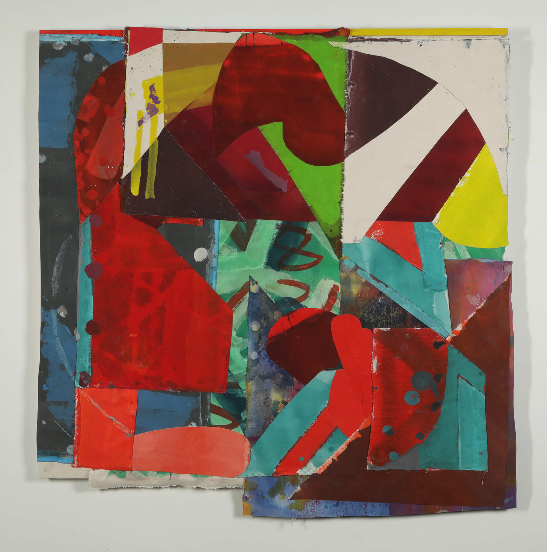
Music analogy? – more punk frenzie than hippie pastoral, this painting delivers a jolting image full of vital energy beneath a visually sarcastic, aggressively pivoting, facade. Composer John Cage notably referred to the Rauschenberg’s White Paintings as airports for lights, shadows, and particles, establishing an enduring understanding of the series as ‘receptive surfaces’. ‘Airport’ is an exponentially insightful approach to viewing a painting’s surface as a means to transportation.
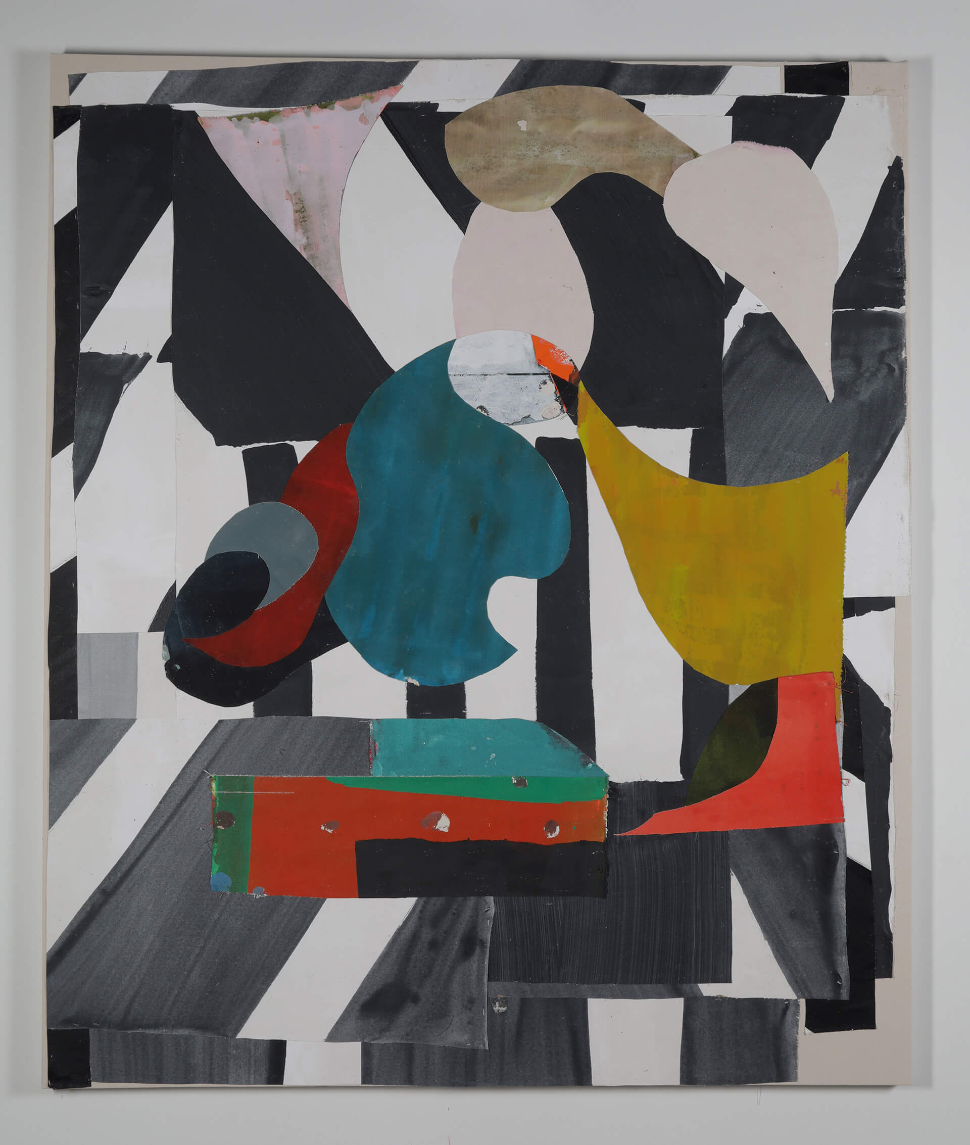
Painted and assembled at the very end of 2018, this work emerged with an unexpected gravity. I frequently find myself drawn to a certain flavor of Spanish painting; think Velazquez, Zurburan, El Greco, Goya, Picasso. Don’t take this as an arrogant comparison of caliber, but more in the sense of Spanish painting’s penchant for bleaching light and damning shadows, and the consequential (virtually ironic) drama. You could even consider the metaphysical light of Motherwell’s ‘Elegy to the Spanish Republic’ paintings. As for Velazquez’s (or Picasso’s) ‘Las Meninas’ ? – I don’t exactly see her waiting around.
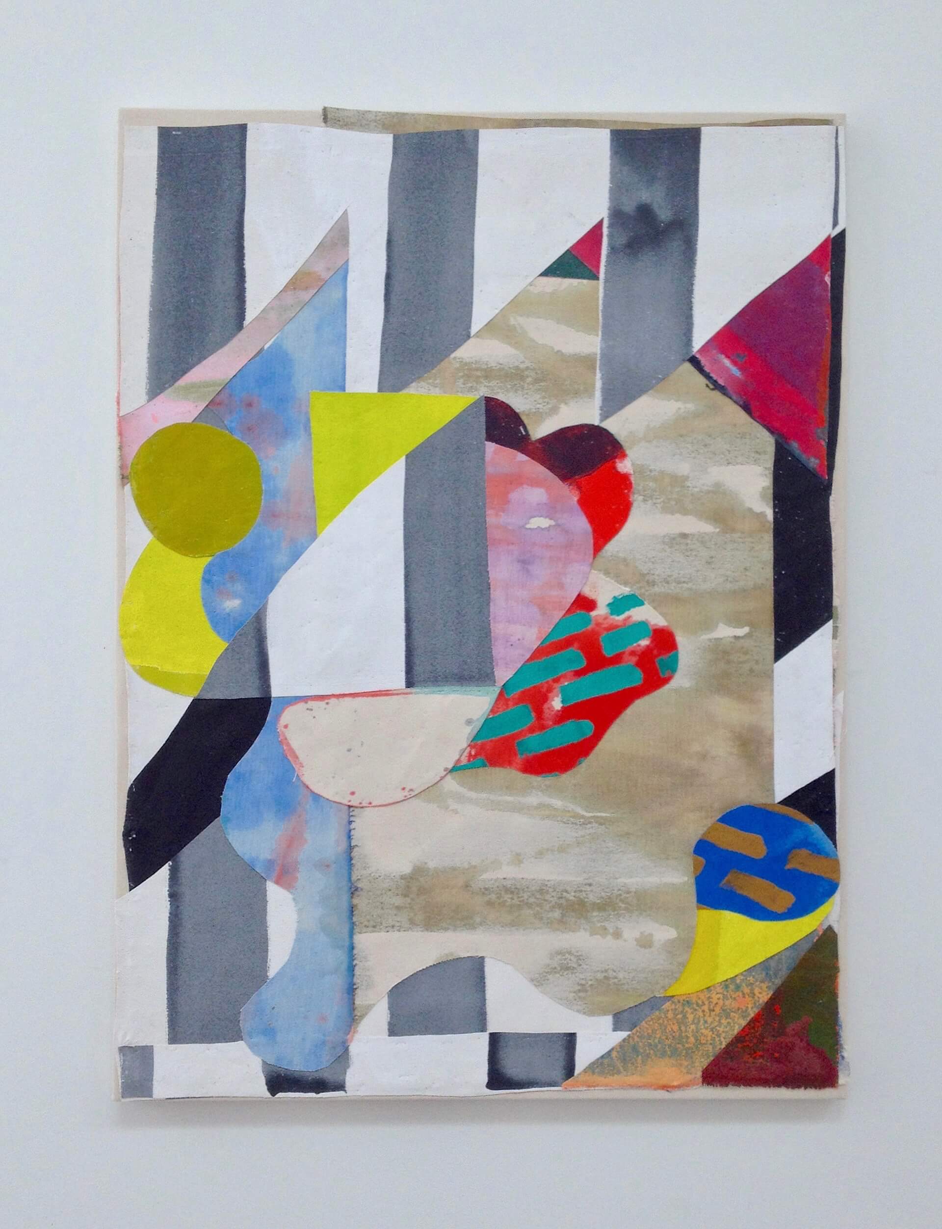
I unexpectedly found myself approaching ‘Memphis’ (‘Design Style’). Very much enjoying the lighter gravity, I attempted to braid this into a more visceral surface. It can often feel like – if the 80’s graphic laminate eked out just a millimeter of substantive depth, the whole concept would collapse. Here, I think the taut shallow space acts something like a frozen pond; you have two radically different states of the same material substance – and it’s a question of thin and thick, and shallow and deep?
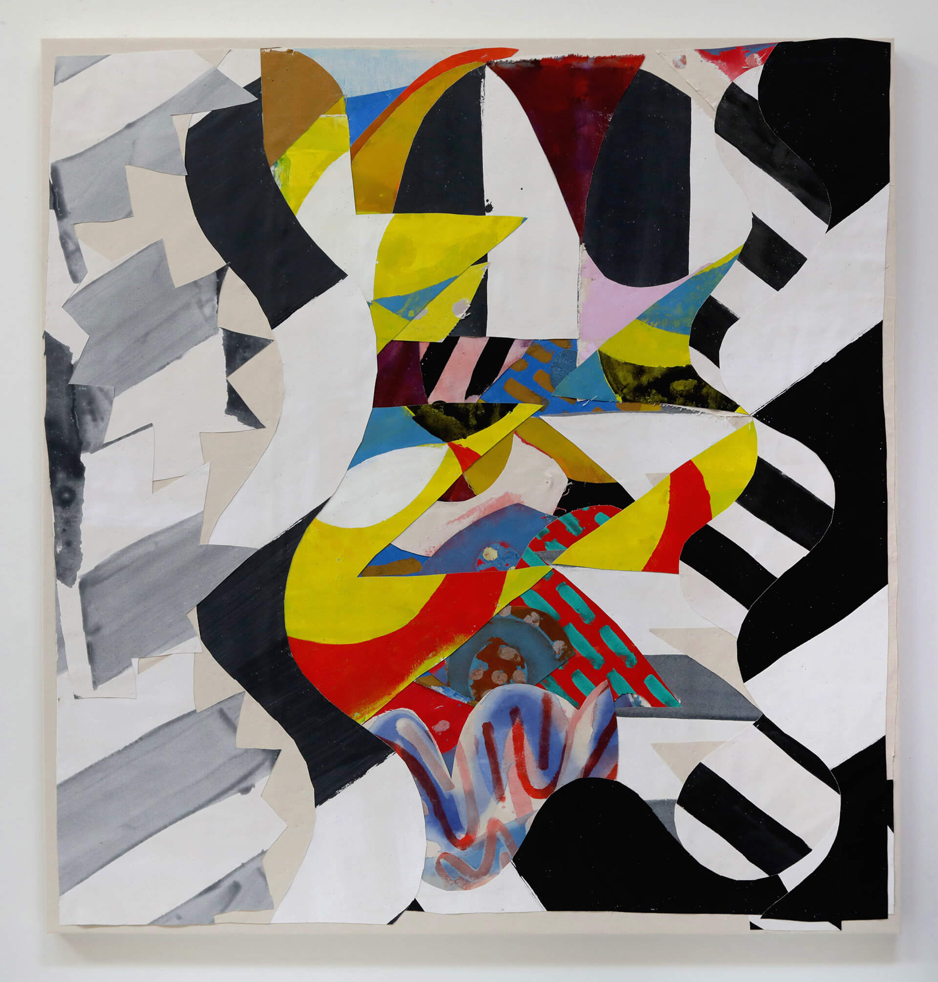
After devoting considerable time looking laterally across Uccello’s panels of the “Battle of San Romano” in London, Florence, and Paris, I became enamored by the thought of slicing and collapsing Uccello’s tableaux into a more singular moment; laminated sporadically and stacked – producing power like that stored in a series of battery cells. The hope would be to concentrate what was a lateral expanse towards a more central, charged point of visual contact with an uncanny sense of episodic depth. The result is a beguiling, perhaps visually devious, depictional space. An aside – I’m thinking there’s a very interesting possibility of re-purposing the use of the word “De – piction”.
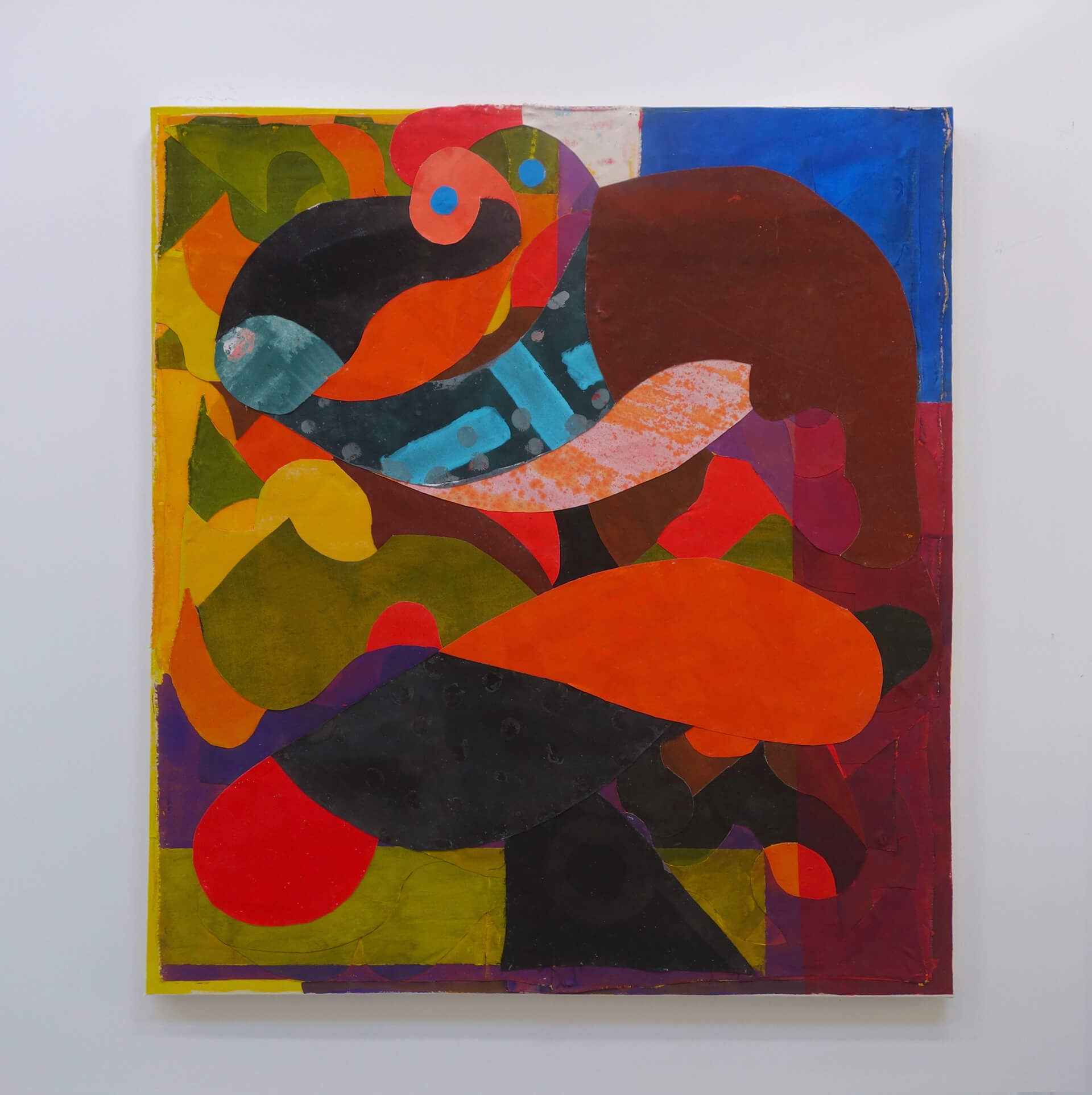
This painting models a voluminous, serpentine undulation as forms and colors appear to braid above, behind and around one another. These serene, intertwining shapes belie an intense sequence of revisions this piece went through. The original piece was partially stripped, parts repurposed, some omitted, some introduced, restained and repainted. Not to draw to literal a reference, but the last 3 years working on a rural forested property, I’ve become fascinated by observing a variety of organic systems which, when circumstantially interrupted, they tend to evolve and grow in the most compelling, surprising ways. The result is a verdantly desirous, genetically driven, visual ecology.
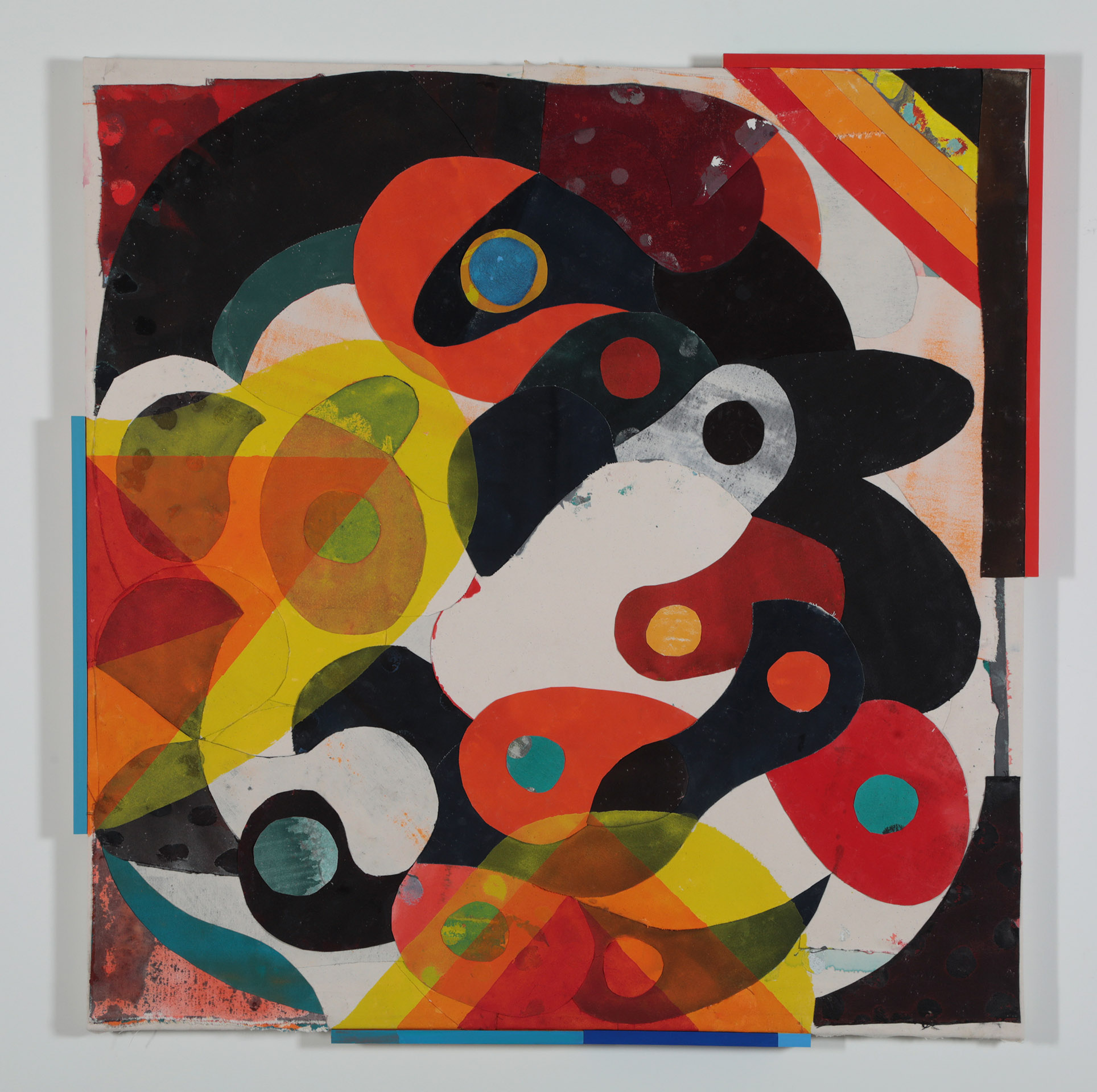
Here is a prompt of a visual form with its own motivation and agency. The looming clamor shows a roiling momentum of the type where Michelangelo’s deity creates man (think ‘brain shaped billowing drapery full of an assorted flock of divinity) or Guston’s gaggle of no-goods cruising the flatlands for the unlucky, or his clashing cluster of arms, shields and nail soled heels; a graced silence of a billowing thrusted trajectory just before contact.
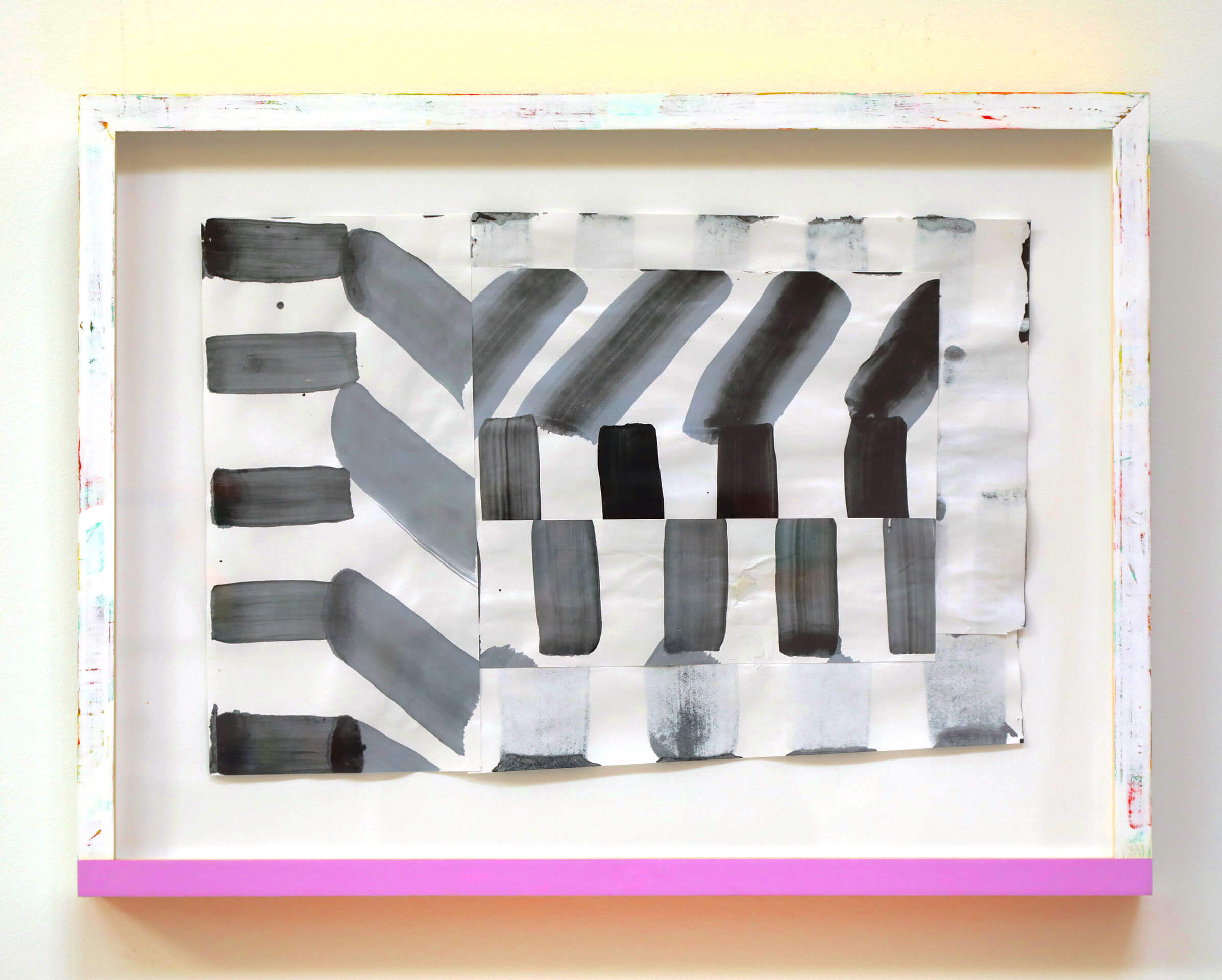
One of the first of a suite of drawings initiated in the late fall of 2018, this piece proffered something of an organic geometry. Donald Judd, in his full on bluntness, said “A rectangle is a shape itself; it is obviously the whole shape.” -But what if it’s not? The whole is not an exclusive act of closure. The whole is an inclusive act of disclosure.To see the thing from nose to tail, from leaf to root, is to know something of the whole, but even then there is an economy to being the thing it is; a vital exchange. It cannot be what it is in isolation. In this simple, systemically, intertwined drawing, there is a respiratory form to be had, as things become drawn into a grouping and released into another.
I would be remiss to not mention Henri Matisse here, not as conclusive comparison, but as orienting one to a type of visual spectrum. “I don’t paint things. I only paint the difference between things.” says Matisse. Spandrals- the space qualified as a ‘remainder’ or the ‘space of adjacency’ produced between arches, became a flourishing space of adornment in early architecture and art. Think ‘music’! The space of difference, the between, is fascinating as it becomes a thing.
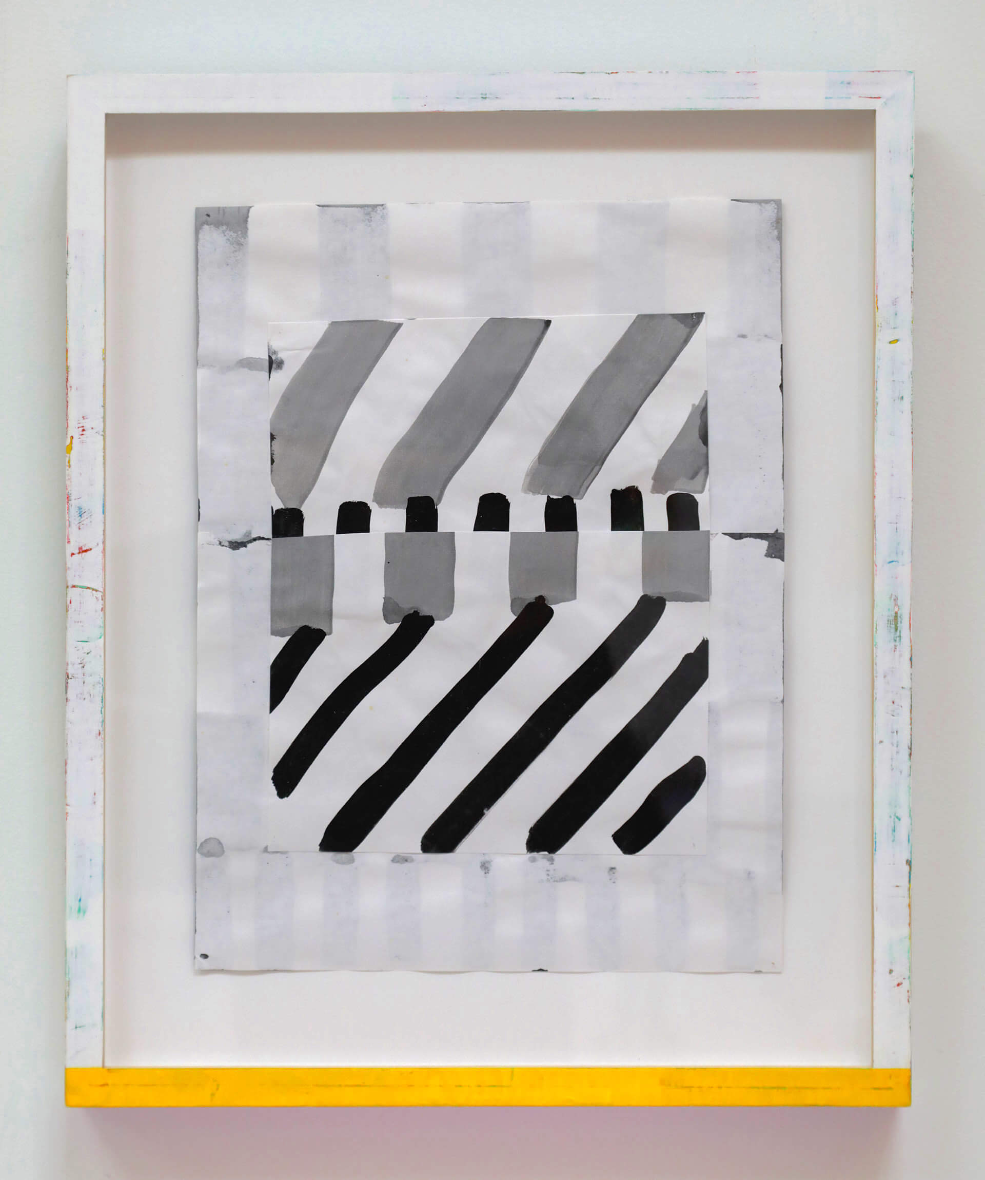
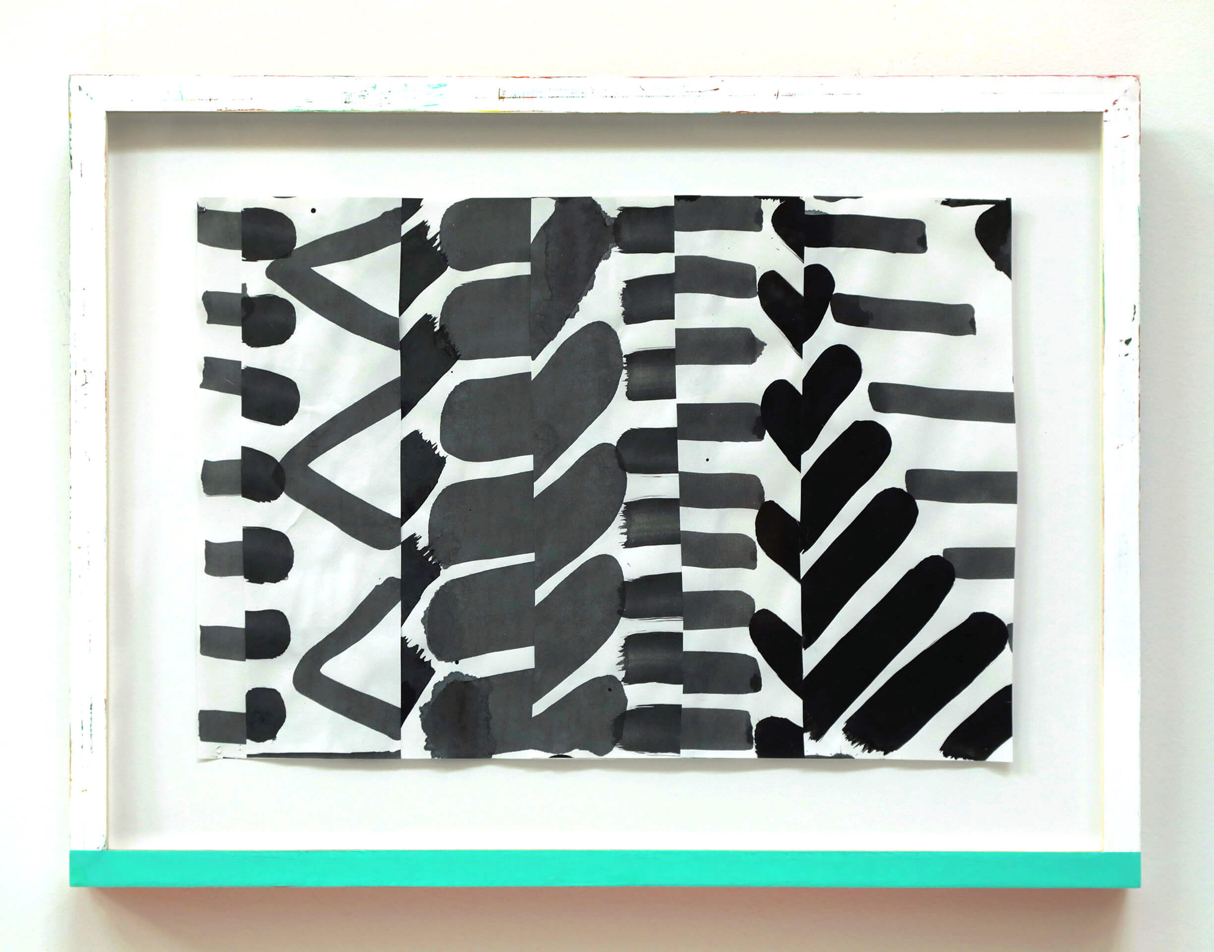
If ‘delightful’ is to be found in this suite of works on paper, it’s here. It’s hard to convey just how light and clear this piece is, or the kind of whimsical uplift it delivers on viewing, but there it is. Beyond any contrivance, this drawing truly seems to riff on some sort of homage to the ‘Memphis Design style’. Not quite as flourescent, (just around the edges), nor as remotely stylized, it’s a bit more grounded than the 80’s brand, but definitely shares a common ancestry. Light on “Memphis” zany, but fascinated by the style’s signature ‘shallow’, its definitely not freighted with nihilistic angst or sturm und drang. Maybe more like – if Alex Katz had been indoctrinated by the Bauhaus.
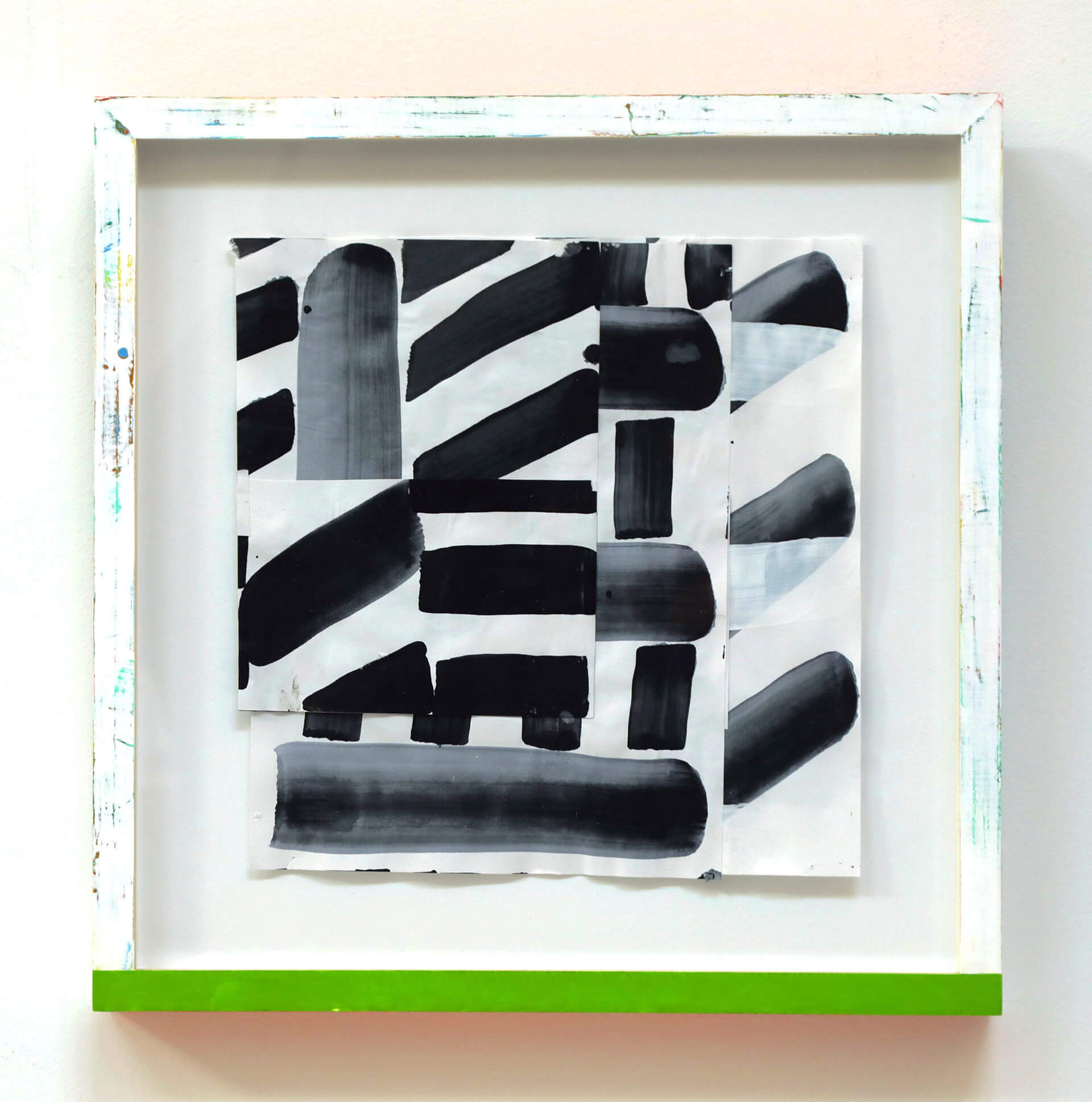
This work on paper comes from a suite of drawings initiated in the fall of 2018. The ‘cobbled’ arrangement is used to avoid contrivance and embrace a guileless candor. The result is a hilarious mix of elegant awkwardness, humor and play. The engorged voluminous strokes are placed alongside marks of a shallow, flat black. You might think – Laurel and Hardy. You might not. And then there’s the so-called ‘translucent whites’ – if that’s even ‘a thing'(?). This stout little square models a game of unexpected play. And, well, this drawing has a glow! Perhaps indulging a little on the side; by using complimentary colors on the top and bottom of the hand crafted frame, the spirit of the piece is extended beyond the frame.
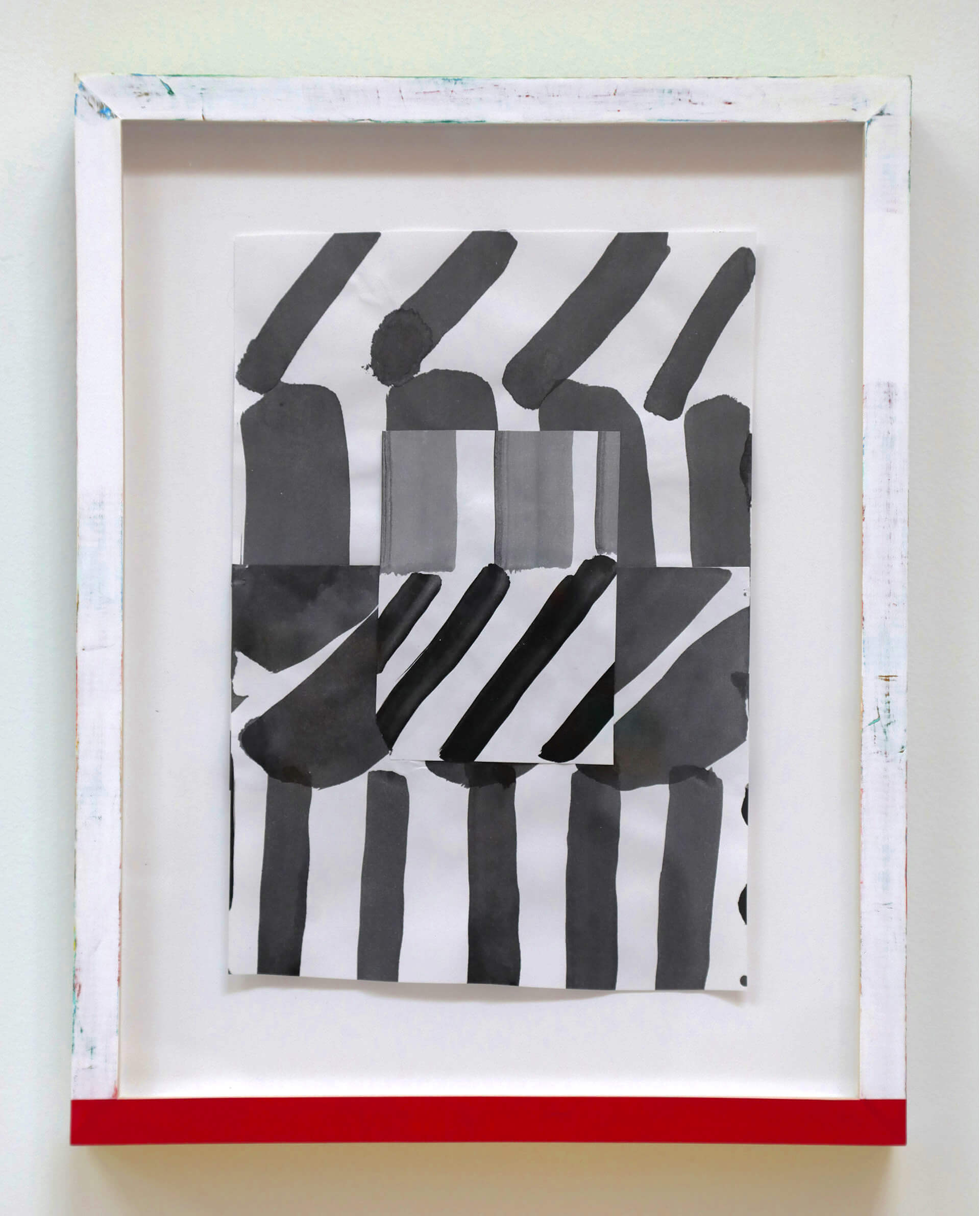
2D design class? Naw. Well, maybe. And then some. Like – critically more ‘some’! From a suite of drawings launched in late 2018, this drawing became piled and stacked into a totemic, vertical inquiry. Cezanne’s proposed ‘vertical=depth’ aspect of seeing always felt both insightful and puzzling. In the realm of our creaturely vision there seems to be some truth. But when is it not – true -that is? Mondrian’s game of Hegelian negation showed it could be otherwise. With the verticality challenged by unanticipated interruptions of unscripted diagonals and horizontals, the result is a surprising rhythmic clash of ‘spatially proposing’ and ‘spatially defying’ tangential contours, varying repetitive sequences and dimensionally suggestive shapes.The visual experience vascillates between material surface and imagistic depth; alternating oppositional fields humming along as a visual motor. These ‘oppositional fields’ are conceived as complimentary sequences. For example, the complimentary colors on the top and bottom of the frame extend another frame. A spirited, ephemeral frame of colored light softly ghosts the rigid material frame.
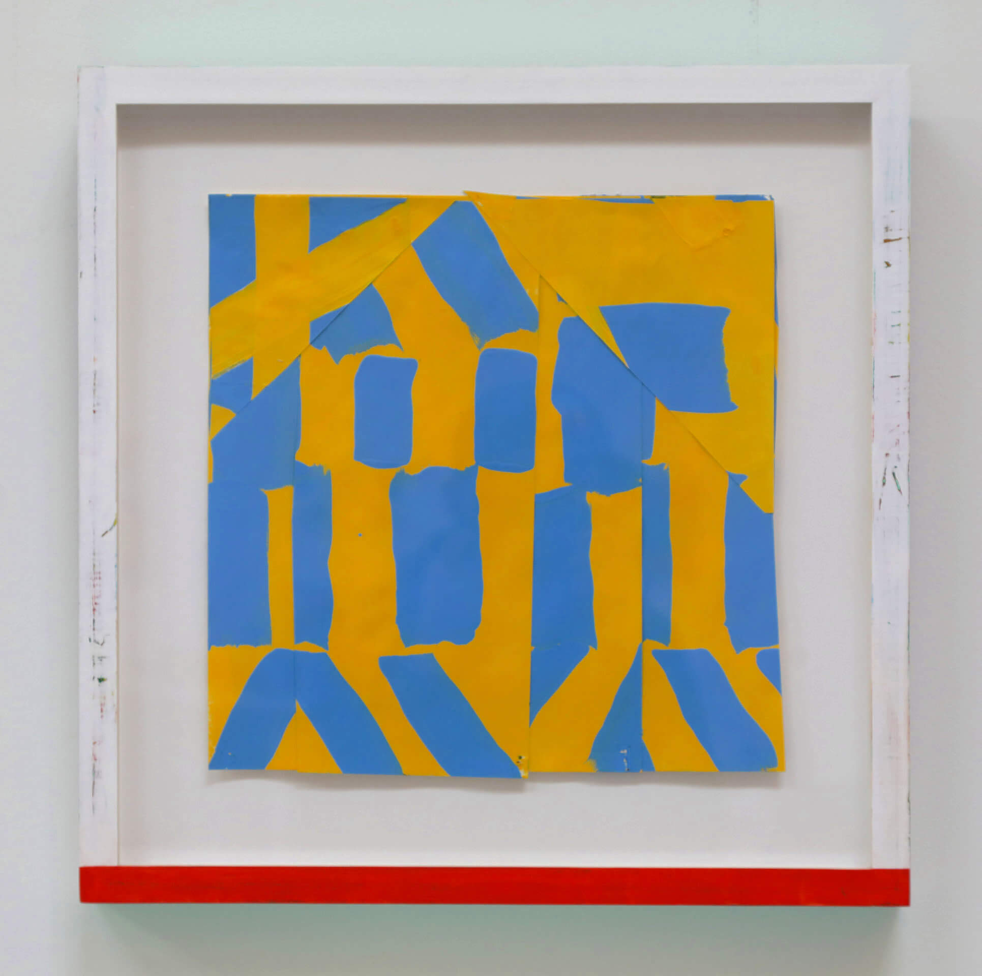
This work on paper is part of a suite of drawings began in the fall of 2018. The body of work is conceived in intervals of contrasting color, mostly black and white. Why? Because our biological ‘wiring’ finds such visuals most striking and alluring. And here, such an allure helps to splay our focus. Between the chemical yellow and the fictitious cadmium blue (thank you Charles Wright) I now believe we can leave Kansas. The jumpiness of the background yellow desires to assert itself promoting edificial structures above and over the blue, which in fact is on top of the yellow, – – or is it? And so, even though there’s no place like black and white, Oz’s Kansas is nothing but hopeful. the chromatic binary hues promise more surprising departures to come. Once we’ve introduced more dimensions to the color game (chroma, temperature…), the possibilities grow exponentially.
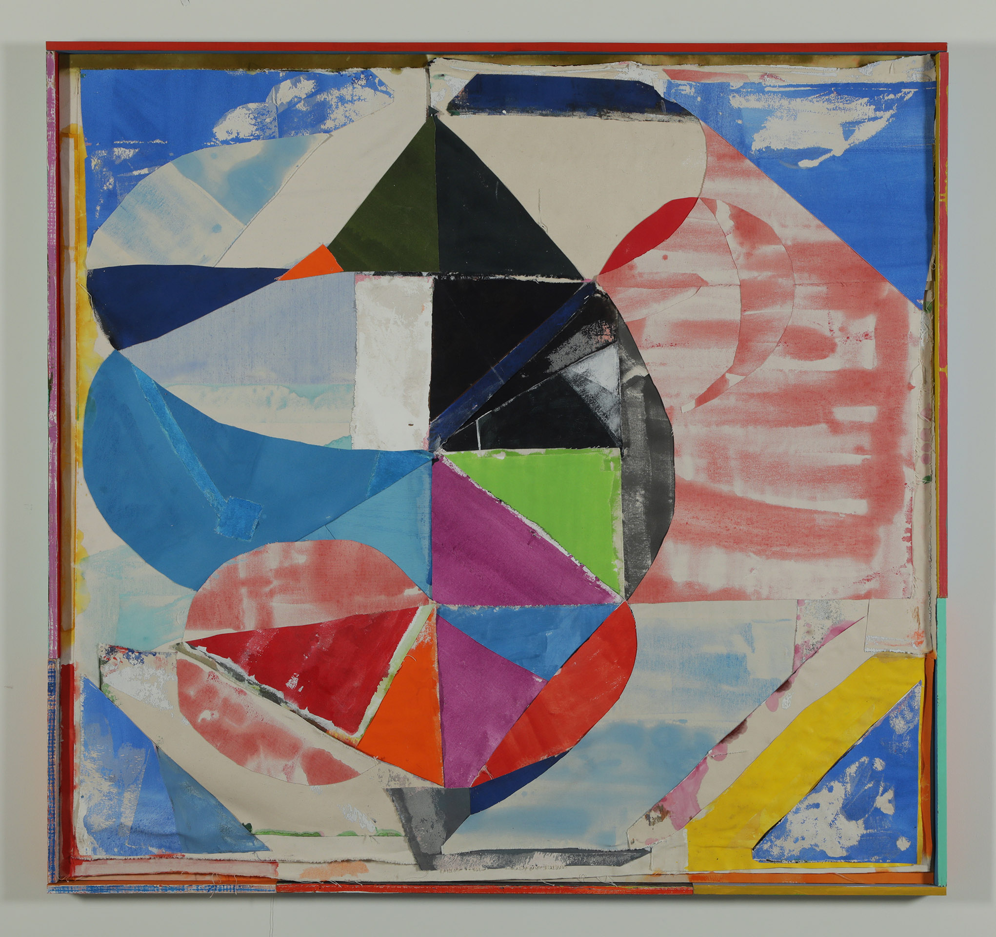
‘Laissez faire’ would be the most apt description of this painting. You might begin with cloud watching. Like the steam from a tea kettle, smoke rising from an opium pipe or a plain old afternoon-cognitive-cloud from one of those day dreaming reveries, this buoyant, bubbling form was an easy going start, the very first large painting, made on Whidbey Island. A very discriminating four year old referred to the piece as “The Circus Painting”.
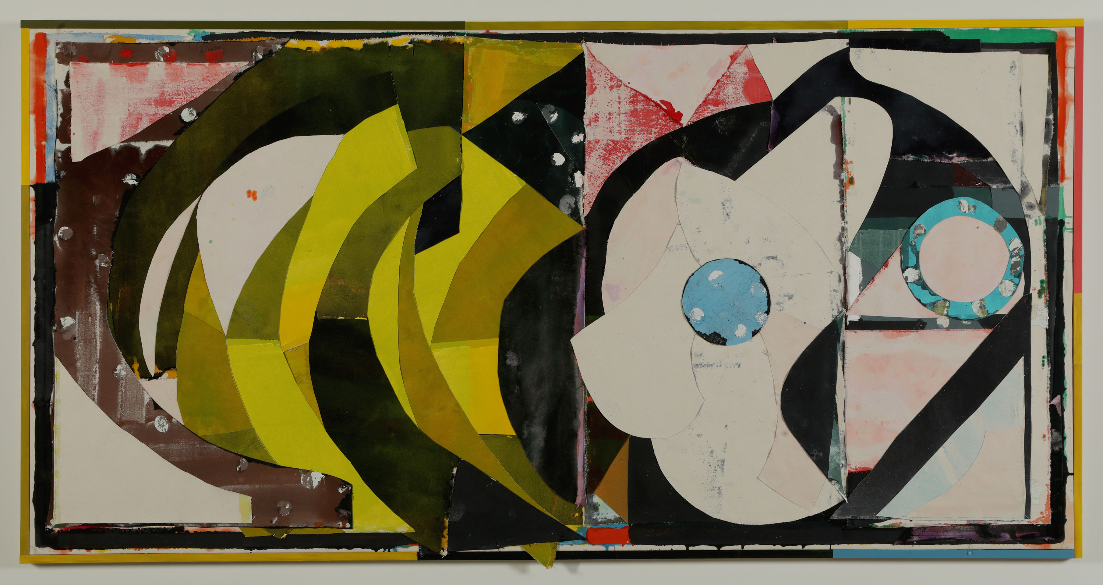
One of the first paintings produced in this series served as something of a moment frame for a seismic shakedown of this image. The original version was pulled apart, re-stained, repainted and reconfigured into the current painting. The process revealed something about how well constructed the paintings are – the struggle to disassemble only began with ‘challenging’. The process also allowed for the assemblage of the painting to further evolve and emerge much more unexpectedly. There are various eclectic inspirations for the compositions. The northwest coastal tribal art from the Haida, Tlingit and Salish tribes are of definite interest in the manner in which these artist prioritize fitting designs into forms. The nesting of visual multiplicities- simultaneous aspects of seeing, reveals a very complex visual conception. The generative figure/ground relationships vacillate optically, showing an intricate, spirited, agential character. Some of these traits, combined with more superficial inspirations like a chromatic color scale of mid-century flavored yellows – à la Josef Albers, provided other compositional motifs. Fundamentally, not unlike the complex, tribal art mentioned above, as well as the studio work of Albers, there is a driving interest in the phenomena of seeing; the manner in which the physicality of the object, the making of the image, and the subject of the painting are analogized – each identifies with and acts on behalf of the other.